How to make Custom Switch in Android?
Hello World, Today we are going to make a custom switch. Why? Because the
default one looks so boring and ugly. Why we use a switch? As the name
suggests, the switch is used to trigger the value either it is on, or it is
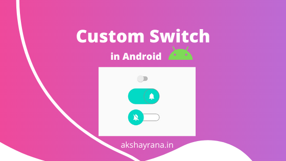
off. Let's see, how our custom switch will look at the end of the tutorial.
In the above gif, there are 3 switches. The First one is the default one and
the second and third are our custom switches. To make these custom switches we
need to follow certain steps are as follows:
Step 1. Add Switch to Activity Layout
First. we need to add the switch to our layout XML file. We will
add SwitchCompat to the layout.
Look at the below code for better understanding.
In the above code, things to be noticed are app:track and android:thumb
attributes.
The track is the horizontal container where our thumb or round shape view is
placed and the thumb is, as I told you before, is the round shape where we
will add an image on top of it.
Step 2. Make Custom Track for Switch
To make our custom track we need to make a drawable file and set the root
element as a selector. So click on the drawable folder and make a new file and
name it as track.
In our track.xml we write this code for making the custom track.
In the above code, we made two items in the selector where the first item
represents the state when the switch is off or not checked and the second item
represents the state when the switch is on or checked.
In the first item, we made a shape of a rectangle and fill white color with
having corner radius with a grey color stroke or outline and in the second
item the only difference is filled color will be our accent color and stroke
will be removed but the corner radius will be the same.
Now let's make our thumb part where we will add images on the thumb.
Step 3. Make Custom Thumb with Image.
To make custom thumb for the switch, create a drawable file in a drawable
folder and name it as the thumb.
In our thumb.xml file, we will write the below code.
as track.xml here we also have the root element as a selector and have the
same item tags but this time we set drawable in the attribute. These drawable
are our drawable file where we will add images. Let's add our vector icons to
use in thumb drawable.
Add images for thumb
Right-click on drawable then click on new then select vector assets and then
choose your icon from clip art. for demo purpose we are selecting notification
on and off icon.
After adding the icons, we need to make drawable files for custom thumb off
and one for the thumb on which will be add in thumb.xml as drawable.
Let's make the first file in the drawable for thumb off and set an image to
the thumb. Check the below code.
If you noticed, we are using the layer-list as the root element and in the
child, we have 2 items.
The first item is our oval (round) shape of the thumb with the size and
background color and the second item is our image drawable with 12dp padding
from the top, bottom, left, and right.
See also:
Cardview with Recyclerview Example
So this was for when the switch is off our custom thumb will look like this
now its turn for thumb true when the switch is on.
Create a new file with the name switch_thumb_true and the code will be like
below.
Like thumb false, this code is similar to it but the differences are we added
the stroke to the round shape and of course change the image drawable.
Now we have made the all necessary files now its time to run our app and your
custom switch is ready. Tada!!!!
This switch is our middle one if you want to make track height small then you
need to do some extra work. Keep reading...
How to make track height smaller than the thumb.
To make a smaller track, we need to make 2 files for the track on and track
off and set to selector file as drawable as we did for the thumb on and off.
First, change your track.xml like the below code.
Now this time we removed the shape code and add drawable files. Now make both
files and let's see their code.
For the first track_off.xml
We are using the layer-list as root element and then the first item has a
shape with the same code on previous track code but the twist is we have just
added a rectangle shape and add 12sp padding to the top and the bottom of the
second shape to make track height smaller than the thumb.
The same thing needs to be done in the track_on.xml
After setting these files to track.xml run your app and your track height will
be small.
If you like this article do share it with your friends and batchmates and
don't forget to subscribe to our newsletter if you haven't joined already.
Thanks for reading have a nice day.
Share this Article 👇
Subscribe to our Newsletter
By subscribing to our newsletter you're agreeing with our T&C.


